

For Copyhackers, 2013 was the year of The Great Value Proposition Test and The Summer of Buttons, two separate mega-experiments in which we helped some 30+ startups run A/B tests on their headlines and primary calls to action.
With big wins. And some losses.
But always with this goal: to learn.
It’s the tests that make our tickers hurt – not just the ones that make our clients’ accounts grow – that we love best. Which is why we’ve decided to do our first ever roundup.
Take a walk down memory lane with us as we discuss our 13 favorite AB tests of 2013 – only 2 of them from our blog 🙂 – and then vote for your fave at the end! Oh, and the best comment wins these 3 great biz books of 2013 (US, UK, CAN, AUS & NZ only):

In no particular order…
Favorite Test 1: 36% More Purchases
Tell ‘Em Why They Need Your Product
Favorited By: Lance
We talk a lot about the importance of creating a clear, compelling value proposition… and the two primary elements of a great UVP: uniqueness and desirability. But don’t forget to give your visitors context for your product — the where, when, and [especially] why people need it in the first place.
This simple test was based entirely on giving visitors additional context for an automotive repair product, the outcome of which was an amazing boost in sales.

Why We Loved This Test: It’s so simple that you can’t NOT test this on your own site.
Read more about this and other thought-provoking tests on the Marketing Experiments blog
Favorite Test 2: 10% More Sales
Big Image Beats Tiny, Squishy Content-Cram
Favorited By: Joanna
People often ask us if they should use short copy or long copy – as if you only need one or the other. As tests like this one, courtesy of VWO, show us, the closer a prospect is to converting, the less they often need to read your pitch.
So, as in all negotiations, once you’ve made your point, stop talking and let the prospect convince him or herself.

Why We Loved This Test: Because it sparks an interesting and – depending on whom you’re talking to – often short debate on copy vs design.
Read more about this and other tests on I Love Split-Testing (by VWO)
Favorite Test 3: 11% More Clicks
Clean Button Beats Button Featuring World’s Strangest Icon
Favorited By: Joanna
Copywriter Michael Aagard always shares the most fascinating A/B test results – and I’m looking forward to takin’ him on in the “CROpywriting Battle” at Conversion Jam 2014 in Stockholm.
In this test he shared on the [highly recommended] Unbounce blog, Michael showed how simplifying the visual design of a call-to-action button led to an 11% lift in clicks:

Why We Loved This Test: Because the control is sortuv hilarious. And because the verb “get” in a button wins yet again.
Read more about this and other button tests on Unbounce
Favorite Test 4: 211% More CTA Clicks
Who Says You Can’t Buy Friends?
Favorited By: Lance
There’s a good chance you’re too close to your own product or service to immediately recognize shortcomings in your copy. HubSpot shares a terrific example of how Friendbuy used data to identify the source of a poorly converting landing page and overcame the “forest for the trees” problem.

Why We Loved This Test: The folks at Friendbuy identified an amazing opportunity for their CTA, worked their theory, simplified the copy, and emerged victorious!
Read more about this and other tests on HubSpot’s Inbound Marketing
Favorite Test 5: 621% More Clicks
Download Is A Dirty Word
Favorited By: Lance
VWO shares a cautionary tale of choosing the wrong label for an important call to action — in this case, the seemingly innocent word, “Download”. The team at Price Charting tested a couple of alternate versions of their main CTA and were surprised by how much of a difference a couple of words can make.

Why We Loved This Test: Improved relevance = impressive conversion gains. Are your CTAs relevant to your visitors’ goal?
Read more about this and other tests on I Love Split-Testing (by VWO)
Favorite Test 6: 632% More Email Signups
Team Romney Actually Wins Something
Favorited By: Joanna
Although technically run in 2011-2012, this A/B test case study wasn’t published on Optimizely’s blog until 2013 – so it qualifies for this roundup.
For Team Romney, each new email address they collected was worth nearly $8 in donations or revenue. By moving their email sign-up fields into the prime real estate of the hero banner, the Republicans saw an impressive lift in leads.

Why We Loved This Test: Because even the best-performing A/B tests can’t help sell certain products.
Read about 3 Romney A/B tests here
Favorite Test 7: 18% More Scheduled Appointments
High-Converting Copy Can Still Make People Smile
Favorited By: Lance
The debate about using clear copy versus clever copy will likely never be fully resolved, but we recently shared the results of a test that challenges assumptions. The lesson here was not which variation won, but that you should be brave enough to test something you may have serious doubts about.

Why We Loved This Test: Sometimes your best customers are those with hangovers.
Read more about clever versus clear on Copyhackers
Favorite Test 8: 235% More Events Logged
Mobile Button UI Beats Blinds UI
Favorited By: Joanna
If mobile is already here and taking over our world, then how come we’re seeing so few A/B tests in mobile environments? This test intrigued us largely because it was one of the few mobile case studies we saw this year.
With this UI test, the team at RunKeeper was trying to increase the number of non-running events tracked. Their winning treatment led to 235% more non-running activities (e.g., yoga) being tracked by the app’s users.
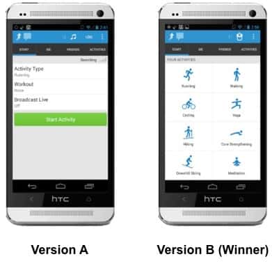
Why We Loved This Test: Because the design of the winner is so elegant, we wanted it to win.
Read more about this mobile test on Localytics
Favorite Test 9: 34% Fewer Leads
Be Careful What You Ask For
Favorited By: Lance
For companies whose primary conversion metric is generating leads, there is typically a trade-off between the quality and quantity of leads. How much can you ask visitors to provide before they stop submitting a form?
The good folks at Monetate recently shared the results of introducing a phone number field into their lead form and the impact it had on the number of leads.

Why We Loved This Test: Monetate changed one variable on their form and got a clear signal from visitors about that change.
Read more about this and other tests on Monetate’s blog
Favorite Test 10: 144% More Form Submissions
“I Declare Bankruptcy!” — Michael Scott, The Office
Favorited By: Lance
It never gets old. Visitors tend to respond well to on-site messages that reinforce off-site messages. Marketing Experiments highlighted one such example of a client who brought its PPC ad headline copy into the landing page headline. The results, while intuitive, are surprising in magnitude.

Why We Loved This Test: This uber-simple headline change resulted in 2.5x more leads. Pay attention to your PPC ad to landing page congruency.
Read more about this and other tests on the Marketing Experiments blog
Favorite Test 11: 19% More Downloads
No Such Thing As A Silver Bullet (But There Are Better Bullets)
Favorited By: Lance
We appreciate Michael Aagaard’s transparency about the things he tests on his own site, ContentVerve.com. This compelling test involved telling visitors how much time they’d have to invest in a product to extract value.

Why We Loved This Test: It offers more proof that you can meaningfully impact visitors’ decisions with seemingly small copy changes.
Read more about this and other tests from Michael at ContentVerve.com
Favorite Test 12: 14% Fewer Downloads
Love for the Humble Text Link
Favorited By: Joanna
The cool peeps at Metageek let us run this test on their much-visited download page for inSSIDer. We ran 4 variations against the text-link dominant control… and they all lost, but the one shown here was the most disappointing ‘loser’ for me.

Why We Loved This Test: Because it runs counter to the CRO world’s long-held belief that an easy-to-click button will always beat a text link… and it opens up a new discussion about perceptions of ‘slick design’ as a UX flag.
Read more about this text link vs button test on Copyhackers
Favorite Test 13: 95% More Clicks
The Asinine Button Color Test
Favorited By: Joanna
People hate button color tests. I’m one of ’em. But for the purposes of this year’s Summer of Buttons, we tested everything related to buttons – including their colors. And we found, time and again, that button color is pretty damn important.
This shouldn’t come as a surprise.
What is a surprise is just what a statistically significant difference the color of a button can make. Now, the following test wasn’t a pure button color test; the copy was also tested. But if you read the explanatory post, you’ll see why we feel good about saying that the higher the contrast your button has against its page – or the more noticeable it is in its environment – the better that may be for conversion.

Why We Loved This Test: Because we hate button color tests! But we loved this! It changed our minds and softened our cold, jaded hearts…
Read more about this and other buttons tests on this Copyblogger post
For 2014, we’ve got even more free CRO help in store – so sign up here if you’d like to work with us without paying a penny.
And remember to leave a comment below for your chance to win the 3 great biz books we mentioned above. Cut off for comments is Monday, Jan 6. (Make sure your Disqus name links to your Facebook or Twitter so we can reach you if you win.)


Conversation