

Every Pop-Up Box Needs an Opt In Button & an Opt Out Button
- Users will almost always choose to take no action at all
- If users want to opt out, get them to confirm a negative consequence
- Prospects make more informed decisions when consequences are defined
Check out our list growth over the last 18 months:

The graph starts in October 2013. Ticks along quietly for about a year. And then, as of October 2014, starts to swing up noticeably.
We went from daily sign-ups in the double digits… to daily sign-ups in the triple digits.
In this post, we’ll tell you exactly what changed.
Let’s start with where we were coming from.
(Hint: It’s probably where you’re coming from.)
We’d Been Using All the Tried, Tested and True Tricks to Get Signups… To Meh Results
About a hundred thousand posts have been written about how to get more of your visitors to opt into your list so you can build the hell outta that list, establish relationships, nurture relationships, sell, grow, hire, and on and on. A healthy-sized list with healthy engagement is a wunnaful thing.
The big to-dos for list growth are things that we started doing almost as soon as we launched Copy Hackers back in Oct 2011.
We put an opt-in box in the sidebar of our blog.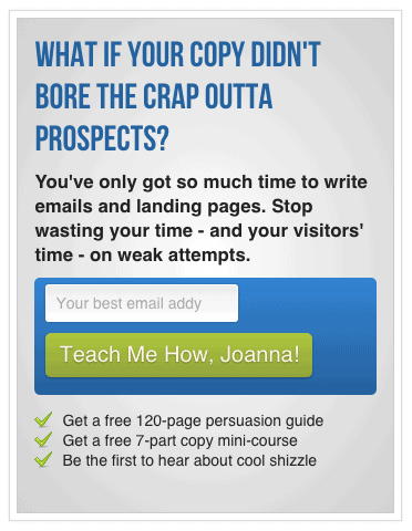
We put an opt-in box at the end of every blog post.
We tested opt-in boxes at the end of posts and tailored them for different posts.

We created a sign-up page with reasons to sign up.
We had an opt-in form in the footer of our blog.
We had hub pages for top topics, with opt-in forms.
We had an opt-in form in our Hello Bar.
We put links to our sign-up page in all of our ebooks and in the ebooks we guest wrote for folks like Unbounce and Get Response.
We even used Pop Up Domination for a while to intercept visitors with opt-in offers.
We did all the things.
We left no stone unturned.
But our list growth was annoying at best and frustrating most other days. A tiny fraction of our new visitors converted into subscribers. The rest just… vanished.
That’s because, although we were doing everything right to capture subscribers, all of those “right things” were just a little bit wrong. And that little bit of wrongness was costing us 80+ sign-ups a day, on average.
What We Were Getting Wrong:
Asking Visitors to Opt In Wasn’t Good Enough
Choice without consequence is no choice at all.
When a visitor is presented with an opt-in form, it’s so often the case that said opt-in form has just one button, and that button is there to be clicked if you choose to opt in. If you choose not to opt in, you do not have to click a button to state your preference; you simply X out, click out or otherwise ignore the opt-in button. Most of our opt-ins are active and opt-outs are passive.
That’s the problem.
With passive or undeclared opt-outs, your visitors never have to actively state that they do not want your offer.
Further, they never have to actively state that they are willing to live with the consequences of opting out. They aren’t faced with any consequences whatsoever. So the easiest thing for them to do is not to opt in but to opt out – to reject your offer – which is the very thing you do not want them to do.
In her TED talk in 2011, Sheena Iyengar said:
“In order for people to understand the differences between the choices, they have to be able to understand the consequences associated with each choice, and the consequences need to be felt in a vivid sort of way, in a very concrete way.”
She cited 2 studies to support her statement:
- People spent less when they held cash in their hands than when they used debit or credit because cash felt real, and there was a clear consequence to parting with that concrete thing
- More people enrolled in 401(k) plans when they were asked to think about all the positive things that would happen in their lives if they saved more
People can better make decisions when they understand consequences in real ways.
There Are No Choices. Only Consequences.
Whenever a person is presented with a decision to make, that person automatically considers a sort of menu of options including but not limited to the presented option(s).
For every yes, there’s a no, whether that’s implied or explicitly stated.
So when you’re presented with this…
…it seems like you’ve only got one choice: Enter my email address to learn how. We marketers tell ourselves that we’re focusing the prospect on the one and only goal.
In fact, you have at least 2 choices no matter what marketers want to believe:
- Enter my email address to learn how.
- Do not enter my email address and do not learn how.
Each choice carries its own consequences. Some good. Some bad.
In the madness of the decision-making process, your visitor compares her choices and weighs their consequences, focusing on the one(s) she’s directly presented with and only vaguely considering the one(s) implied. Her goal is to make her life better, which often means making her life easier…
…And what could be easier than not taking action at all?
What could be easier than avoiding the decision?
If I go ahead and enter my email address in the form above, I will learn how to stop writing boring copy… but I’ll also have to 1) type and 2) deal with the possibility of getting sold to, getting overwhelmed by info, losing precious hours reading posts, actually taking time to implement what I learn, and more. We try to minimize the negatives in our copy; we write “no spam”, “quick and actionable” and “privacy guaranteed” and hope that that’ll do the trick. But that’s only dealing with the explicitly stated choice. That’s not even touching on the implied alternative: do not enter my email address.
Enter Bounce Exchange.
They’re the team responsible for most of the big ol’ pop-up boxes you’re presented with on sites from Conversion XL to Red Envelope, usually when you show exit intent.
Last fall, Bounce Exchange reached out to us.
We’d written this post and this post, both of which featured Bounce Exchange and neither of which put the service in a particularly glowing light. We’d been rather vocal about our distaste for “scuzzy” opt-out messaging commonly used by services like Bounce Exchange, such as the No message here:

Our problem with those opt outs? They’re just not very nice. They can’t possibly create warm-fuzzies for the brands that use them. They make visitors feel bad about themselves. And they encourage opt-ins only because a visitor does not want to be associated with the negative alternative – and that’s no way to grow a happy list.
Bounce Exchange asked us, in the spirit of experimentation, to try their service out and just see if it worked.
We’re nothing if not up for a good experiment.
Here’s What Happened When We Started Collecting Leads Using Pop-Ups with Opt-In AND Opt-Out CTAs
(More about this in my interview on Social Media Examiner’s podcast)
Before I launch in, let’s be clear: I’m not an affiliate for Bounce Exchange. I don’t get anything for saying nice things about them, and I don’t get my hand slapped if I say harsh things about them. I’m objective, unbiased and just tellin’ m’story. Further, this isn’t a Bounce Exchange review, so I won’t get into the experience of working with them, but suffice it to say it’s been very good and filled with loads of great ideas, great tests, all that fab stuff you’d hope to get for $4000+ a month.
You may recognize this pop-up from our site:

What is that pop-up doing that most others are not?
There are quite a few secrets to the success of the Bounce Exchange pop-up, but the one that stands out clearly to me is the one we’ve been talking about throughout this post: I have to choose to opt-out, meaning that if I decide not to take the freebie offered, I have to choose (or say yes to) a negative consequence.
I don’t get to escape unscathed. If I decide not to opt in, I have to live with the consequences of my actions. “No, I reject the persuasion guide.” It’s the expressly stated alternative choice that sets up a clear consequence for not clicking the orange Yes button: rejection.
When we added this pop-up to our site,* here’s what happened to our list growth:

The dark blue represents the sign-ups our ol’ skool methods brought in. And the pale blue represents sign-ups the Bounce Exchange pop-up brought in. As you can see, November 2014 saw nearly 4 signups from Bounce Exchange for every 1 that the rest of our efforts brought in. March 2015 saw a nearly 5:1 ratio.
The lesson?
Stop giving your prospects a choice as if consequences are not built in. As if that makes you a nice guy.
Every choice has a consequence. Put the consequence on the page. Make the prospect aware of the consequence so they make a more informed decision.
If you can express consequences in concrete ways, you may simplify decision-making for your visitors and see your list grow because of it. Just putting your offer out there isn’t enough. As Sheena Iyengar said in the same TED talk:
“We choose not to choose even when it goes against our best self-interest.”
Every choice you put before your visitors has its consequences.
Put the consequences on the page.
But Does the Consequence or Alternative Always Have to Be Negative?
Negativity is a broad spectrum in shades of grey.
That said, most consequences are negative. The question is, how negative do you have to get?
You may have noticed that our “rejection” opt-out button is not harsh. It’s not one of those “No, I choose to be a dimwit buffoon” buttons. But is it negative? Yes. Because there are negative consequences associated with opting out – so why would we present doing so as positive, especially given that we don’t want people to feel good about taking that option? (NOTE: We always want them to feel good about themselves. Their options are up for grabs.)
You do not have to be mean when you message a consequence of not opting in. Case in point:

And here’s another:

(You’ll notice that the 2-button approach works best with interruptive elements, like pop-ups.)
In his TED talk, John Maeda of MIT and formerly of the Rhode Island School of Design talked about choices and simplicity (start at 12:53). A child presented with a big cookie and a little cookie chooses the big cookie; a child presented with a big pile of laundry to fold and a little pile of laundry to fold chooses the little pile. We want more enjoyment and less pain.

Keep that in mind when you write your opt-in and opt-out button copy.
Test opt-in button copy that focuses on enjoyment and opt-out button copy that focuses on pain or work. This way, the opt-out button copy doesn’t have to be dark-grey negative; it’s on the brighter end of the spectrum, but it still registers as an undesirable consequence of not opting in.
And if, after all of this, you find you don’t really give a damn about building your list – you just wanna get more sales and clients today – use the idea of consequences like so: stop thinking of your prospects’ many choices when you write your copy, and try writing copy that instead expresses the consequences of not working with you.
~jo


Conversation